Home › Forums › Help and Support › Calibrating woes with Dell P2715Q
- This topic has 16 replies, 4 voices, and was last updated 6 years, 6 months ago by
 Florian Höch.
-
AuthorPosts
-
2019-11-22 at 12:26 #21154
Hi there, I wonder if someone might be able to help before I pull out what’s left of my hair.
I have a Dell P2715Q, and I’m trying to calibrate with a Spyder 4 Pro for photo editing use. I have chosen the following settings:
- Photo D50, Gamma 2.2
- LCD White LED
- Correction – Auto (None)
- Changed color temp to 6500k, as they are the temp of the bulbs I use in my office.
- White level changed to 100.00
- Calibration Speed – High.
When the calibration is finished, in general colors within photos look half-decent, but on light greys (think, Facebook, browser header/tabs, etc) these have a green-ish tint to them. I can’t tell whether this is correct and I’ve just been looking at incorrect colors all this time, or something is amiss here.
Can anyone help fathom what’s going on with my calibration? More than happy to add more info if you need it.
2019-11-22 at 16:52 #21156Several sources for this error, there are other threads with the same issue:
1-calibration used a low number of patches (calibration speed high), so some errors in your native uncalibrated grey ramp go unnoticed.
Solution: Use medium or slow speed, or a better & faster measurement device like i1d3.2-your HW (graphics card) is not able to apply properly a calibration without truncation artifacts banding. For example intel iGPUs, nvidias over dvi, older nvidias, some newer nvidias under some circustances, nvidias without applying more than 8bpc in control panel and all of them (including AMDs) if you let other program than DisplayCAL to manage calibration load (VCGT tag in ICC files) into GPU.
Solution: test a smooth 8bit black to white grey gradient (like lagom’s gradient PNG) in a non color managed app like MS paint.
Make sure that you do not use other app for calibration loading than DisplayCAL if you use MS windows. Make sure that your screen did not go to standby since last boot.
If you see those grey issues it is extremely likely to be caused by GPU. Maybe you can enable dither in drivers in nvidias… but usually you’ll need a better GPU for these task (AMDs work OK out of the box with all bitdepths & connecstion) or a monitor with HW calibration.3-Test above were all OK, smooth gradients, or you did a slower calibration and now non color managed gradients look smooth, but you see those grey issues in color managed apps like GIMP of Photoshop.
Solution, one of more of these:
-use idealized profiles: single curve + matrix.
-use color managed apps with high bitdepth processing (internal) and dithered outputs to GPU: Lightroom, Capture One. Maybe 10bit in Photoshop may work too, but LR & C1 solutions are better (universal, for all HW).
-learn to live with that issue (Firefox, GIMP)-
This reply was modified 6 years, 6 months ago by
 Vincent.
Calibrite Display Pro HL on Amazon
Disclosure: As an Amazon Associate I earn from qualifying purchases.2019-11-28 at 17:20 #21247Thanks for the response Vincent, and apologies for the delay in response. I started calibrating the monitor just before I was supposed to fly out overseas on business. I’m back now.
I noted in a number of places that I should get the i1D3, and I’ll look into that…they’re not cheap though, which is a bummer! Regarding colours, maybe half of the problem is that I just don’t really know what options I should be choosing from the ‘Display and Instrument’ and ‘Calibration’ tabs. It’s definitely not as plug-n-play as the Spyder software, but then i didn’t get great results from that either.
Could you throw some wisdom my way regarding settings options? I’m sure something is amiss, given that the colours are more or less ok, the greys are a little green, but I also noticed today that something is a bit funky with the blackpoint when I open up my photo editing app (Capture One). Clearly it’s all related to the last calibration, but I’m scouring the internet for ideas as to what settings I should be using.
Thanks for your patience.
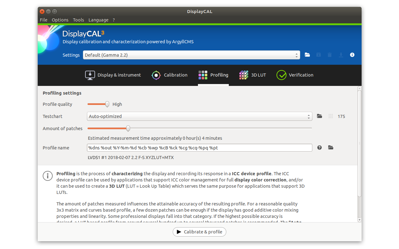
2019-11-28 at 18:03 #21248Basic common configuration: I think these are default configuration settings, so no secret magic recipe
Calibration:
White D65 (6500K daylight), gamma 2.2, speed medium (if you have a slow device). Set black & white level as measured.
Choose White LED/Standard LED or a name like that (=common sRGB LED display) for Spyder4 as colorimeter correction (upper right)Profiling:
single curve + matrix, black point compensation (BPC) ONNow when a popup will show up with RGB bars to fix white. Fix brigthness too, to your desired level (remember, you set “as measured”=you do not care).
When calibration & profling is done, a profile is created. Install it using DisplayCAL GPU calibration loader. Easy & straightforward.
Now test what I wrote in my previous messages:
-gradients & that stuff in a non color managed enviroment, like MS Paint and lagom grey gradient.
This test reveals calibration issues caused by GPU, by its driver, by to low number os measurements (=calibration speed too high) or by not so good measurement device.
Vertical bands with sharp edges is almost a smoking gun for GPU issues (or caused by its driver) .
If this is OK, calibration is visually OK.
If you see strange things in darker end with no color management (MS Paint in windows)…they are in calibration. DisplayCAL/ArgyllCMS behaves very good there, so I would point Spyder as culprit.-gradients y color managed enviroment, like CaptureOne. Open the same gradient & check… but if you made the profile the way I said (single curve+matrix & BPC=ON), this profile is “idealized”, color management using that profile will be very very simplified (at the expense of some accuracy), so banding/tints caused by rounding errors are unlikely to happen, and also CaptureOne and its dither works perfecly fine to avoid most of them.
If visual test is OK (1st one), this 2n one with color management should be OK with capture One and that profile type.
If 1st test fails with sharp, thin edge banding with pink/green, it’s likely to be GPU/driver… usually is not correctable. It’s not monitor’s fault.
If 1st test fails with color tints or issues in grey without these sharp green/pink bands in middle grey… it could be caused by not accurate measurement device or calibration speed too high (need more measurements)
2019-11-28 at 18:08 #21249If all of these go OK, then you can try more complex profiles, BPC=OFF, check if it results in banding (rounding error) in CaptureOne or whatever app you use.
Above is just a basic setup that allows you to minimize issues caused by color management and check if something weird happend in calibration. Although it’s a simple profile type a lot of people will be able to use it for work… so if it goes OK, you may not need to test other things, just use it and check/validate/recalibrate from time to time.2019-11-28 at 18:22 #21253Hi Michael,
I don’t dare comment publically on some products but I have seen some instruments not measuring as expected, compared with other instruments. Like, instead of measuring RGB=255,255,255 as 5000K, this particular Spyder 4 reported 4600K. To some, this 400K difference is insignificant. To me? It is. It may or may not be related to your experience.
2019-11-28 at 19:14 #21255Hi Michael,
I don’t dare comment publically on some products but I have seen some instruments not measuring as expected, compared with other instruments. Like, instead of measuring RGB=255,255,255 as 5000K, this particular Spyder 4 reported 4600K. To some, this 400K difference is insignificant. To me? It is. It may or may not be related to your experience.
CCT is not a proper way to address a a white point. You can have a white point 5000K but be far away from D50 (5000K daylight):
Your 400K difference is not only 400K difference (curve projection), it could have a pink or grenish tint very huge, or no tint at all. This is why DisplayCAL/ArgyllCMS report whitepoint in the way it does
2019-11-28 at 19:38 #21256A) If CCT is *improper* to “adress a white point”, why do you use it above?
Calibration:
White D65 (6500K daylight)B) 400K is a huge visual difference, anyway you look at it
2019-11-28 at 20:42 #21257A) I did not use CCT. I said “6500K” (which is a HUGE number of white points) AND daylight. That is only ONE color where 6500K “isotherm” crosses daylight curve.
That’s the reason your way to address white point is not correct and can lead to misunderstanding: You can have 6500K as white point and don’t be white at all. It’s the same issue than in my previous mesage with 5000K CCT daylight vs 5000K isotherm on the pink side
You can educate yourself about this subject in a paper/video from Andrew Rodney (Digital Dog) if you do not like the fast “MS Piant” diagram I painted for the other thread, or check wikipedia where you can see those “isotherm” curves of CCT crossing daylight or backbody curve of “whites”.B) Again it is not correct. Depending where you add 400K it is visually huge or not. CCT difference and color difference are loosely related.
Wikipedia is another good source to see visually this if you did not know about it. Cooler whites are more visually packed (less distance between them) for the same CCT difefrence than warm whites (“white” meaning in daylight or blackbody curves).2019-11-29 at 9:45 #21264Morning guys!
OK, so a couple of things based on last night’s calibration.
1. I don’t have single curve + matrix under profiling. Is this something to be downloaded, or should it come as standard with the download?
2. I went for the longest calibration time…took around 4 hours, but the colours are WAY better. I manually changed the RGB and white point controls myself to a ‘green’ required setting on both. Once everything went green, I started to calibration.
3. Something weird is going on with my black point now. If you look at the photo I’ve attached, you can see dark blocks all over the image. This is happening with all my images, and everything now has a slightly washed out look to it.
Any thoughts?
Attachments:
You must be logged in to view attached files.2019-11-29 at 10:12 #212661- My fault… you may see this:
But I have enabled “Advanced” in Options menu so my screen is a little different.
IDNK right now equivalent setting with advanced=disabled. DisplayCAL creator may know it.Anyway, if you configure a matrix-profile with equal TRC curves (=“single curve”) and enable black point compensation (akin to “my display has a superb contrast even if ot is not true”) then black crush, banding, grey coloration (pink-magenta/green) etc… that you see in color managed apps (specially in the best ones regarding rounding errors/truncation like C1) it is likely to be a calibration issue, hence related to GPU limitations or measurement device limitations.
There should be a way to reuse your current grey calibration (the one that should look visually OK in non color managed apps) and profile again without calibrate. I do not remember those settings right now, check doc or ask Florian.
2019-11-29 at 10:20 #21267Thanks Vincent…you, sir, are an officer and a gentleman!
So, interestingly, I enabled advanced options and a new drop-down appeared, which included Single Curve + Matrix! Righteo then, so here are my 3 main screens, so do let me know if anything is amiss before I start another 4-hour calibration. Also, is there anything in particular I need to know about Brightness and Contrast. Is there a rule of thumb, say, which states that you should always have maximum contrast, or half-brightness, or anything like that?
I’m very process-oritented, so once I have this nailed down, I know that I can just repeat the process next time around. Aside from that, do let me know if my settings look strange. In Profiling, I’ve duplicated your settings…if it’s good enough for you, it’s good enough for me 😀
Thanks for all your help, it’s really appreciated!
*edit – Urgh, I wanted to replace images…but it’s just added them.
-
This reply was modified 6 years, 6 months ago by
 Michael Beecham.
-
This reply was modified 6 years, 6 months ago by Michael Beecham.
Attachments:
You must be logged in to view attached files.2019-11-29 at 10:32 #21277Wait… are you on a mac? (from screenshots)
Then use default settings.
MacOS color management engine (for UI and Apple apps) has some bugs and cannot deal with non ideal extremely simplified profiles.
That idealized & simplified profile used in DisplayCAL defaults for macOS should be something like “single curve”+”matrix”+”BPC=ON”, but IDNK if there is an additional simplification applied by DisplayCAL to avoid all those macOS bugs & issues in UI.
Those bugs are related to grey coloration or black crush in apps or system manus, but CaptureOne or Adobe suite should use their own color management engine = the images are rended properly in those app even if Apple apps shows that kind of issues.2019-11-29 at 10:40 #21280Gotcha,
Thanks Vincent.
Interestingly, as I’m sitting here, I’m watching my monitor. Suddently (but gently) flip to a slightly different colour temperature for a few seconds…then flip back. It’s a subtle change, but it’s noticeable…then it happens again. Weird. I’ve only noticed this since my 4 hour calibration last night.
I’ll go back to default settings for the next calibration. Any wisdom to share on monitor brightness and contrast?
2019-11-29 at 11:03 #21281With setings I mean the upper combo box, but better to wait or ask to Florian, DisplayCAL creator.
I would say “go manual” with single curve + black point compensation = on, but IDNK if he does someting else to simplify resulting profile to overcome macOS limitations.Regarding brightnes&contrast settings IDNK what features you use in C1 or Adobe suite.
Storing actual black point in profile if you keep max contrast @ your whitepoint can help with softproof when you use “simulate ink” (it would lift black differently)… but you use a mac you you are limited if want to avoid macOS color engine errors in UI.
Also we do not know if you print or if you softproof… or if you should be in a certain ISO settings by contract with your printerlab/customer (you should know that by now if you need it)…. or if you compare a print under certain lamp against display (a setting in which lamp fixes certain values for white point & brightness for screen)… etc.Too many uncertainties. So if you do not know, D65 white, default factory settings for contrast and lower/raise brightness when fixing D65 in OSD RGB gains till you find it comfortable.
-
This reply was modified 6 years, 6 months ago by Vincent.
-
AuthorPosts